Design Thinking + UI
in an innovative Influence Marketing tool
Digital Influence Marketing was a brand new strategy a few years ago. So, me and my team, we were allocated on this new product that would be one of the first software of Brazil in this industry.
We were so excited to build it, and I am very proud about what we designed and developed.
First thing that we did was a big meeting with the team (Developers, Product Owner, Designer, Qa analyst, and Managers that would be working on the product) where I conducted a Design Thinking Dynamic, so the team could start to brainstorm about this new chalenge. This was the first time I aplyied this methodology in this company and it was a big success, the team got totally engage to the our initial roughs and flows. This was very productive because we have an interdisciplinary development about what we wanted the product be.
The name of the product was chosen: Influency-me
In the beggining of the meeting this was the CEO first idea for the new product and he wanted to make the team understand it, so we all have the same idea about the product.
"A platform to engage influencers, with its own methodology, to work on SEO, improve reputation and generate sales."
But... after hour of brainstorming and having ideas, our "headline" have changed and become something more completeand accurate, easier to explane.
"For companies looking to attract attention to their brand, the Influency-me is a Cloud Influence Marketing solution that allows you to create a network of relationships with influencers. Unlike current market tools, our product is complete, integrated, and has its own methodology that guarantees superior results"
 |  |  |  |
|---|---|---|---|
 |
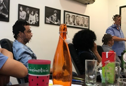
Here are some photos taked while we were brainstorming abit the new product. I am sorry about the creepy roughs, I am not the handwrite kind of designer, but the things will be pretier on the next prints because of photoshop (in this project I wasnt using Adobe XD yet).
This below were the first wireframes we did for the project influency-me.


It was functional ? Yes but, we wanted something that would look not only functional, but social, modern, make it more atractive for the users.
So when we beging to think about the search screen, we wanted to do something to meet the standarts of a good international software.
This was our first shot:

While we were thinking about the flow, we hire another designer to develop our logotypo. So he did this logo below:

Based on his work, we defined our styleguide.


And then stated to aply to our screens.


After we launch this product, we did a lot of improvements based on what our Costumer Success team found in costumers feedbacks, back in those days we werent using UX Research yet.
This product became 3 diferent projects. One for the companies find and hire digital influencers. The second for the digital influencers manager their contracts with the companies. And the third project was for internal team to manage influencers and companies accounts.
Today this product has evolve a lot, is beatiful and very easy to use.
I will show you some screens below.

